Rental Booking Form UX
This project involved fixing some of the UX issues surrounding Arnold Clark Rental's current online booking form with the goal of increasing conversions.
The Problem
There had been some concern passed down from the Product Owner that the main booking form on the homepage was overly complicated and they set the task of simplifying it.
At first glance I could see there were a few accessibility issues which could be addressed, but before starting I wanted to get a more of a background on the users as it was a new area of the business for me.
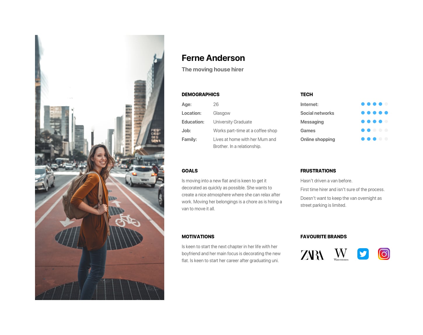
Personas
I wanted to get a feel for they key audience of Rental and how their expectations and goals may differ from users that are looking to buy a car.
I also wanted to make sure that any design decisions I would potentially make would be of use to the user and not impact their needs negatively.
User Testing
Before designing anything I set up a test on UserTesting.com for the current booking form to see if there were any obvious complaints about the form being too complicated.
I set an initial question for the user, asking where their first click would be and why.
I set a main task of asking the user to complete a booking for a hypothetical trip to Glasgow and to describe their thoughts and feelings as they did so, followed by a few survey questions.
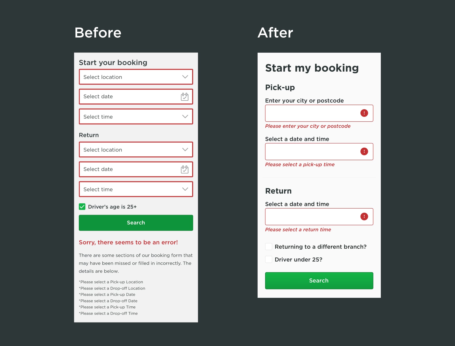
Even although the comments that came back were that the booking form was straightforward and easy to use, I had noticed a few issues from watching the videos. There was confusion due to the form validation being very poor and practically hidden on mobile.
Quantitative Data
There was access to Google Analytics data which gave me a good insight into some helpful stats, such as the average age of users. I also had access to heatmaps of the Rental homepage courtesy of CrazyEgg.
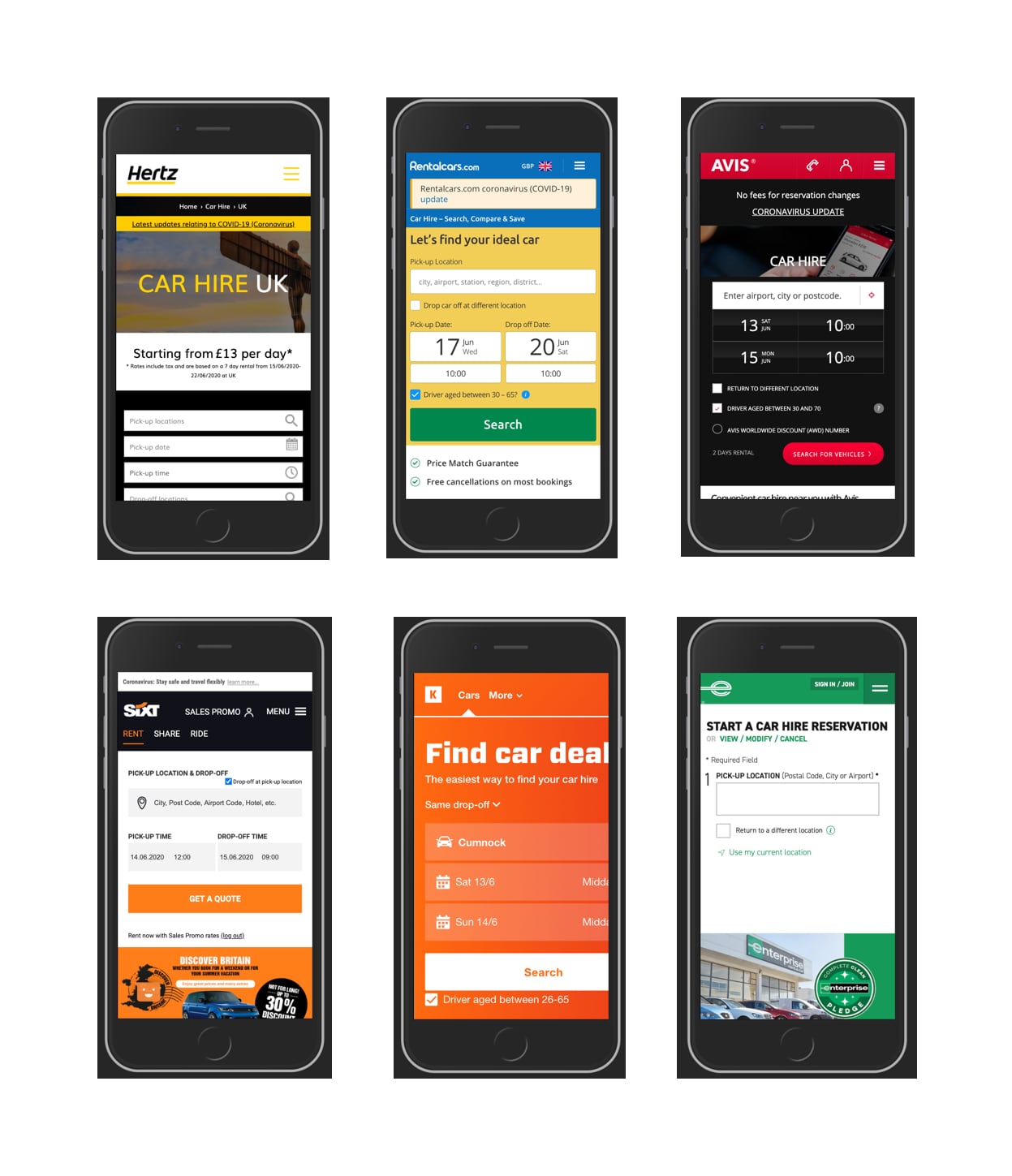
Competitor Analysis
I wanted to take a look at some of our competitors to see if there were any standard design patterns being used or anything they were using that I had overlooked.
Initial Sketches / Wireframes
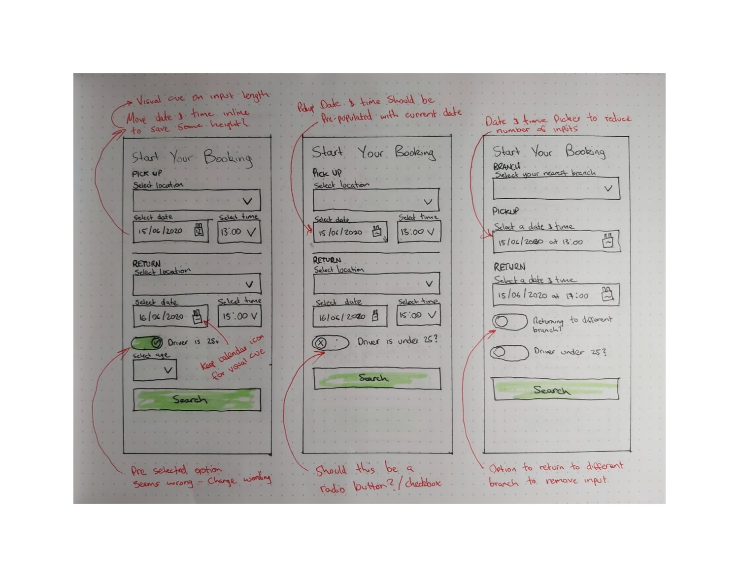
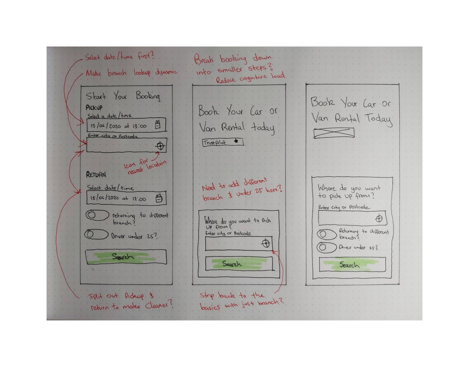
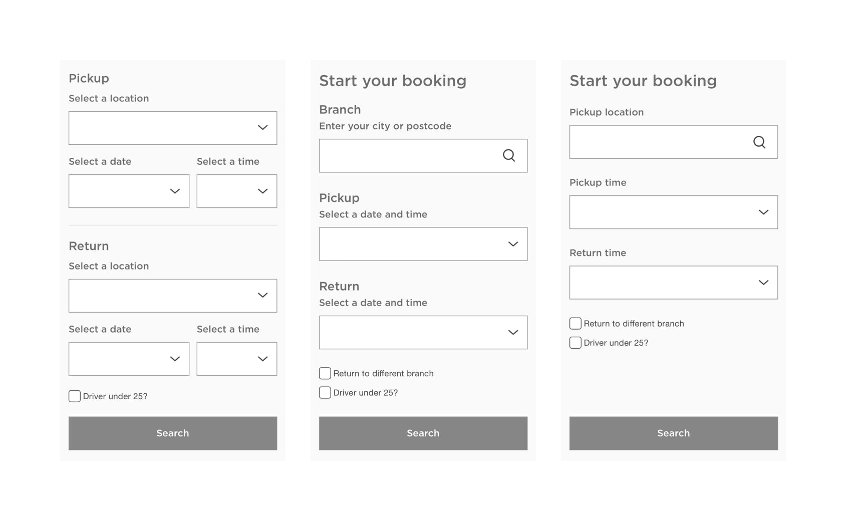
I done some initial sketches based on the information I had gathered from the above. I gained some initial feedback on these ideas from the wider design team as well as the developers who would need to implement these designs.
The developers were able to highlight technical constraints on some of my concepts which saved time when developing my ideas.
User Flow
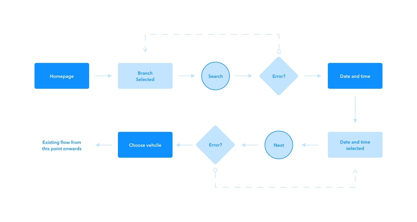
I created a user flow to help illustrate the impact one of my designs could have on the booking funnel as a whole as it was adding a few extra steps to the journey. This option was initially ruled out due to it being too different from the current live version.
The Solution
Below is a comparison between the current form and the proposed design. Keeping the original problem in mind I've managed to reduce the number of inputs from six to three.
A main factor in being able to achieve this was the data highlighting that from the customers that hire from us, the vast amount return their hire to the same branch they pick up from.
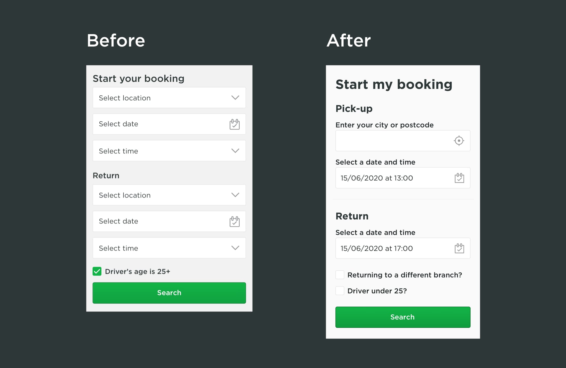
On the original form the 'Driver's age is 25+' checkbox was preselected which didn't seem right. Based on the analytics data I knew that the majority of users hiring a vehicle are over 25, so it made more sense to reverse that question and remove the preselected option.
Form Errors
During my initial tests on UserTesting.com I noticed the form validation was being missed. Below is a screenshot of the improvements to be implemented as part of this design.
Previous: Caledonia Mortgages Website